Table of Contents
I concluded long time ago that dark background is good for me. It will be
- easy on my eyes
environment friendly, i.e.,
- conserves energy because it uses less power
- produces less electronic waste because monitors will last 2 or 3 times longer than bright background. My monitor is over 5 years old but still its black is pure black, and while is pure white. I've seem many monitors black is not black any more, and can't yield bright spot lights any more when viewing movies. My PC is on 24x7, BTW (but my monitor goes into energy saving in 5 minutes).
- suitable for view both during bright day and dark night. Having a bright background may be OK during the day time, but will be painful to view at night, unless I turn on bright light to illuminate the screen, and the wall behind it.
- suitable for view in extreme broad of monitors. Many time I found myself unfortunately having to bear with the old monitors than can only do 60Hz refresh rate. The bright white monitors flicker so dreadfully that my eyes get sour in just minutes.
- work even with broken monitors that have focus problems. I am very sensitive to monitors that have focus problems. Maybe I'm so used to sharp crispy results :-). The problem is always much more obvious in dark-on-light setting. Switching to light-on-dark always make things better.
Recently, there has been a hot debate about the light/dark text/background. I've include the arguments on both sides here. If you don't have time to go through them all, check out the following points that I think that make sense to me.
The most directly applicable research I know of is by Lauren Scharff, who did a study on the readability of several colour combinations, and a follow up http://hubel.sfasu.edu/research/Oxford.html .
However, I think it may be somewhat out of date…
- A study at Stephen F. Austin University http://hubel.sfasu.edu/research/AHNCUR.html produced quite a lot of interesting data… their initial survey seems to have found that black on white was the most generally readable combination, while the more detailed followup did not replicate that; black on grey and (surprisingly) green on yellow were the best performers…
- I think another misconception is that you can compare a computer screen with a lightbulb better than with a piece of paper. When my screen is mostly black its so relaxing for my eyes. Thats also why a lot of CAD software works with a black background and white lines.
May people agree with Maddox on this one:
"I've chosen a black background for most of my text because it's easier on the eyes than staring at a white screen. Think about it: your monitor is not a piece of paper, no matter how hard you try to make it one. Staring at a white background while you read is like staring at a light bulb (don't believe me? Try turning off the lights next time you use a word processor). Would you stare at a light bulb for hours at a time? Not if you want to keep your vision." Maddox (www.thebestpageintheuniverse.net)
- I totally agree, I've been staying/working/playing in front of the PC whole day for quite a long time and I definitely think that light text on dark background is tiring out the eyes much less than the classic black text on white/light background. I also use semi-dark themes for the OS and my browser (firefox) so they ease my daily life.
I think medium-light on medium-dark sites is better. I say medium, because I belive that eyes are not made for hard white on pure black or black on white light on a screen… the contrast too high (…and I believe that you are targetting white on pure black, and not seeing the broad perspective of shades that could be used) Screens are getting larger and larger and I can not understand why a large white rectangle with darker letters could be better than medium-bright on medium-dark, its like reading text on a transparent paper holding it up against the white sky..
Also from a usability perspective medium-light on medium-dark enables you to use colors another way. Orange, yellow, turquise, or pure red® blue(B) or green(G) and similar gets much more visible (think street lights at night) and can be used to grab the reader / viewer of a page in a much more visually and extensive way than a visual homogeny with white as background. Also think how clear the different stuff separated visually on dashboard is when it is dark outside.
Monitors , TVs and other displays all use more power when displaying a white background than when displaying a black background. It takes power to produce light .. the more light , the more power…
Also a black background doesn't strain the eyes like a white one does. One reason for that is that the pupils in the eyes have to contract in order to look at a bright light .. relaxed pupils are open pupils. Another reason is that monitors have refresh rates that causes the eye to constantly adapt to a flickering light .. the lower the refresh rate , the more flicker and the more eyestrain.
A black background however outputs no light (or at least very little in the case of LCD's) and when there is no light , the light cannot flicker .. thus there is no eyestrain.
- [dark background,] they are much easier to read. If you look at all of the old terminals (which were meant to display text/data to users for hours a day) they all use a dark background… Think about it, it's easy to focus on a star in the night sky, but if it were the other way around, a brightly lit sky with points of black, would you even be able to see them? Not likely…
- opticians suggest switching work environment to a light on dark colour scheme, even to people who have no problem with their eyes at all.
But if you are old, the story maybe different:
There's good reason dark text on a light background tends to be easier to read, particularly as one gets older. For most people, it's harder to focus at close distances than infinity, and as eyes age it gets even harder (re: presbyopia). If text is displayed on a light background, though, the brightness of the background helps to close down the pupils to produce smaller apertures, which makes it easier to focus, much like how a pinhole camera works without a lens.
Most above are just excerpts. Search below for the full message and the author, if it interests you.
T
documented on: 2006.10.10
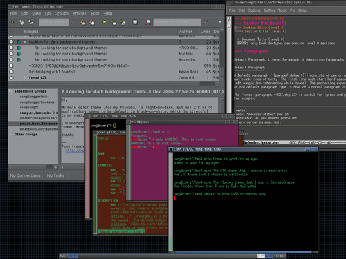
Here is the screen shot of my light-on-dark theme.

- I choose green as my main char color which is good for my eyes
- The GTK theme that I choose is marble-ice
- The fluxbox theme that I use is CalciteCrystal
documented on: 2007.01.01
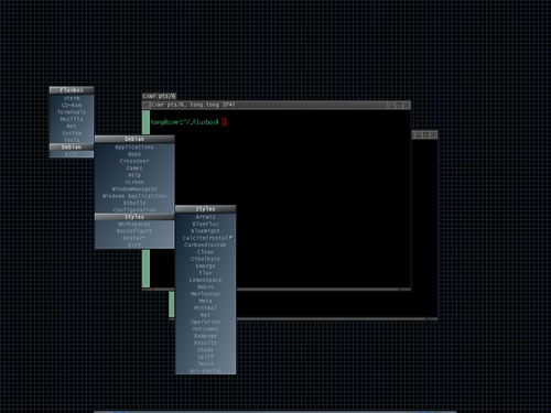
Ok, here is the fluxbox theme that I look at day and night. It is nothing fancy at all,
- background is almost black
- and there is no shiny icons to distract me
But I like it because
- dark background is good for my monitor and easy on my eyes
- no high contract (thus it looks rather dull on first sight)
but when you need to look at it day and night, you will like the it, the colors looks like calcite crystal growing in the dark. FYI, the color is not my invention. Actually, over 99% of the theme is code is not mine. I just looked at all the themes from fluxbox, and put together features that I like in one file.
The menu (big picture):

The active window (big picture):

The file is at: http://xpt.sourceforge.net/tools/CalciteCrystal
Note that if you use the theme and can see the background grid clearly, then your monitor brightness setting might be too bright.
documented on: 2008-03-29
